Web DevelopmentJun 24, 20263 min read
Anatomy of a Landing Page That Converts
Seven sections, in order, and the reasoning behind each one — based on pages we've shipped for healthcare and wellness clients.
By C-Media360 Team
A landing page has one job. Most pages fail because they are asked to do five.
The version that works is usually simpler than the version that gets designed — fewer options, fewer ideas, one clear path from arriving to acting. Here is the structure we keep returning to.
1. A headline that names the outcome
Not your company. Not your process. The result the visitor came for, in their language.
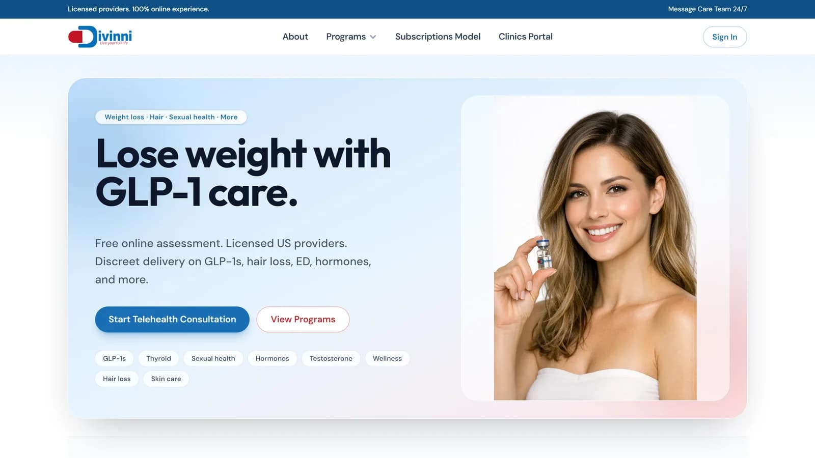
"Lose weight with GLP-1 care" works because it states the outcome and the method in six words. "Comprehensive telehealth solutions" works for nobody, because it describes a category rather than a benefit.
2. A subhead that removes the first objection
Whatever the headline promises, the visitor immediately has a doubt. Address it here — usually credibility, cost, or effort.
Licensed providers. Free assessment. No appointment needed. One line, one objection.
3. One primary action, visible immediately
A single button, above the fold, in a colour used nowhere else on the page. Add a secondary link if you must, styled clearly as secondary.
Two equally weighted buttons is not offering choice. It is asking the visitor to make a decision you should have made for them.
4. Proof, before the pitch
Skeptical visitors want evidence before they want features:
- Named reviews with specifics, not anonymous praise
- Numbers you can defend — years in business, patients treated, jobs completed
- Recognisable logos or credentials where relevant
- Real photography of real people and real work
Stock photography of a smiling stranger in a headset actively reduces trust. Everyone recognises it.
5. The offer, made concrete
Say exactly what happens next and what it costs. Vagueness at this stage reads as something to hide.
If pricing genuinely varies, give a range and explain the variables. A range beats "contact us for pricing" nearly every time.
6. Objection handling, in their words
The three or four reasons people hesitate — put them on the page as a short FAQ. Use the phrasing your customers actually use, not the sanitised internal version.
Every question you leave unanswered is a reason to close the tab and check a competitor.
7. The action again
By the time someone reaches the bottom, they have decided. Do not make them scroll back up. Repeat the same action, with the same wording as the first one.
What to leave out
Just as important as what goes in:
- Your full navigation menu — it is an exit, and this page has one job
- Company history, unless it is the proof
- Multiple competing offers
- Anything requiring a second click to understand the value
Then test it
Every list like this is a starting hypothesis. The version that wins for a wellness studio will differ from the one that wins for urgent care. Ship it, measure it, change one thing at a time.
Want a page built this way? Tell us about the offer or browse recent work.
- Conversion
- UX
- Design